T3 2.0: Fostering Rider’s Confidence with the Connected Cars
for the Rider App Redesign

INTRODUCTION
The Big Picture
A Crisis of Confidence in the Case of Weak Market Regulation
In 2012, tapping a button to request a ride felt magical. By the start of 2018, this magic can cause devastating consequences after two riders were killed during the ride, while China has the world’s biggest ride-hailing market, with an average of more than 20 million ride bookings everyday.
Client’s Challenges
How Do We Strengthen Riders’ Confidence with the Connected Car features to Make Them Feel Empowered on the Road?
“If a car gets in trouble, a T3 expert can use the car’s cameras and microphone to grok what’s going on or just inactivate the car in the worst case scenario.”
Learned from the Kick-off Meeting, T3 (出行)stands out in the market for its tech innovation on vehicles and real-time supervision on drivers.

A market positioning diagram created by me to understand the gap between T3’s business mission and the app’s current state.
THE OUTCOME
Solution Overview
We refined the current user flow and designed driver’s profile as a new feature which would be used in randomized A/B testing to test the usability.

RESEARCH
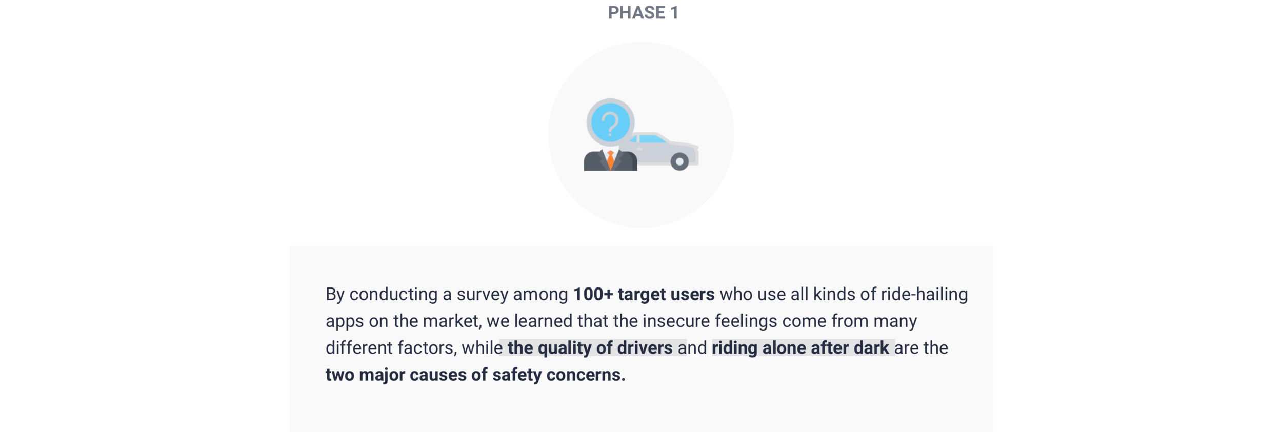
The ONLINE SURVEY
To Understand When & Where Confidence Gets Challenged
The Scenario
Confidence is a Constant Strengthening Exercise While Most Riders Ride Alone
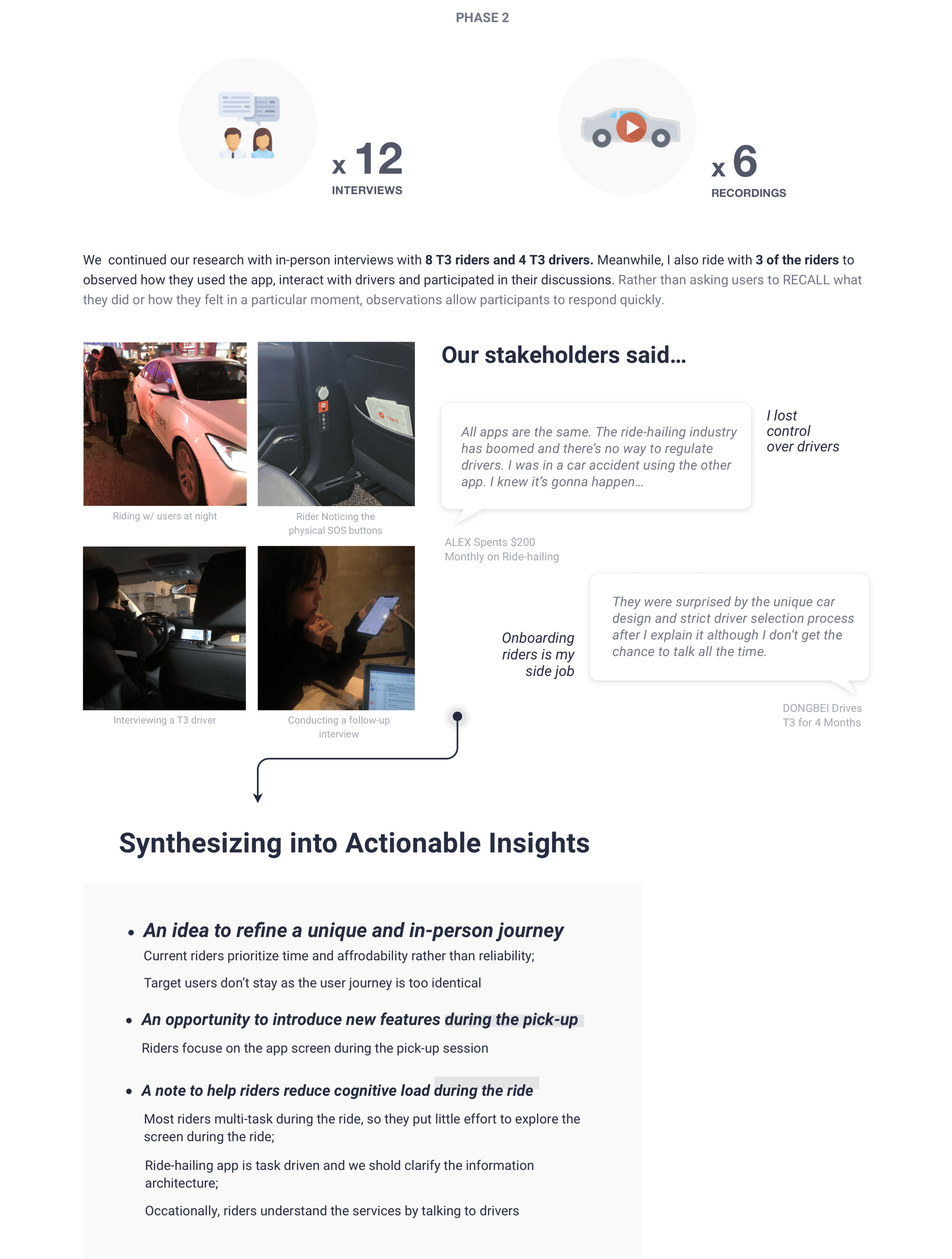
Interviews & Observations
The Feedback was Overwelmingly Identical
DESIGN PROCESS
The Approach
Strengthening Confidence Even When it Gets Challenged
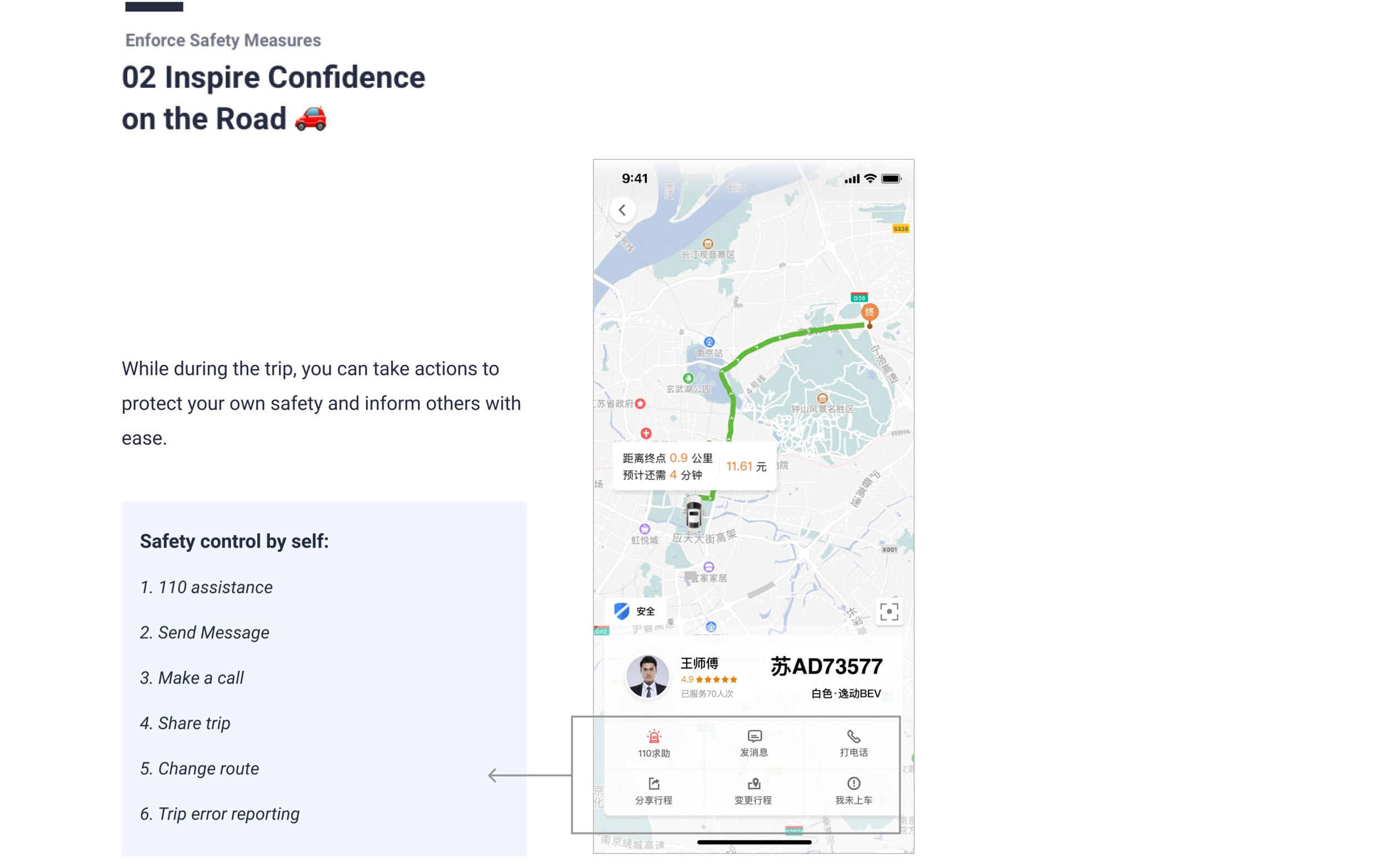
To raise riders’ safety awareness and enforce safety measures, we brainstormed solutions, making sure the redesign aligns with users’ values and company strategy. I delivered hi-fi screens and prototypes to convey the solutions we came up with.
The IDEATION
In an already mature and competitive market, we need to define a desirable role for T3 and how it meet the needs for the scheme’s users.
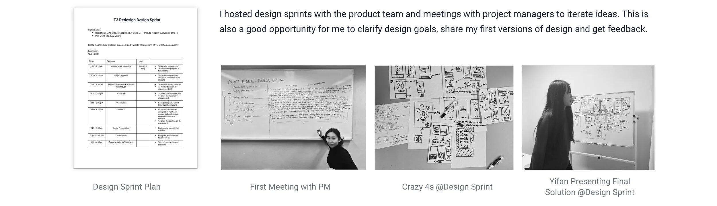
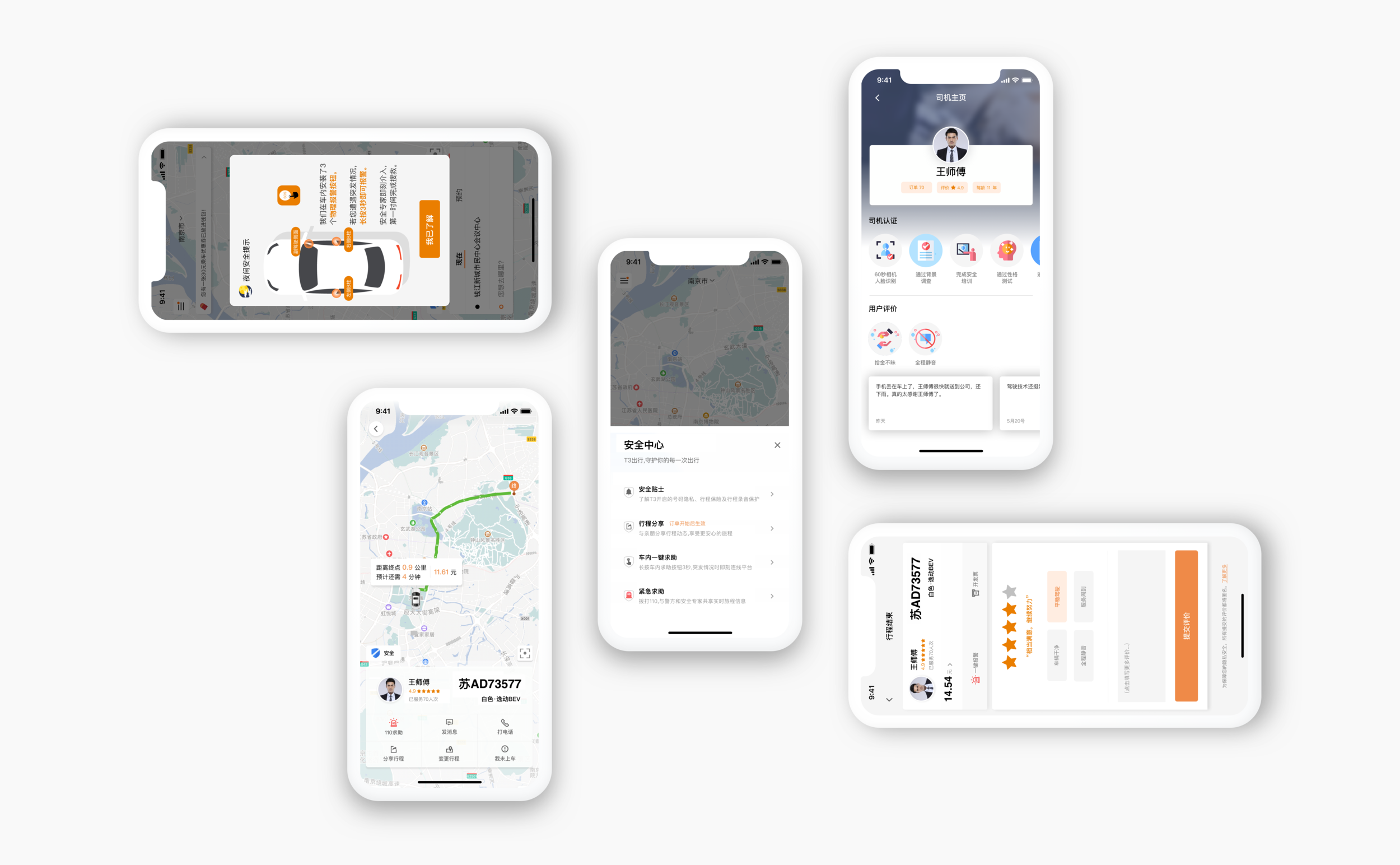
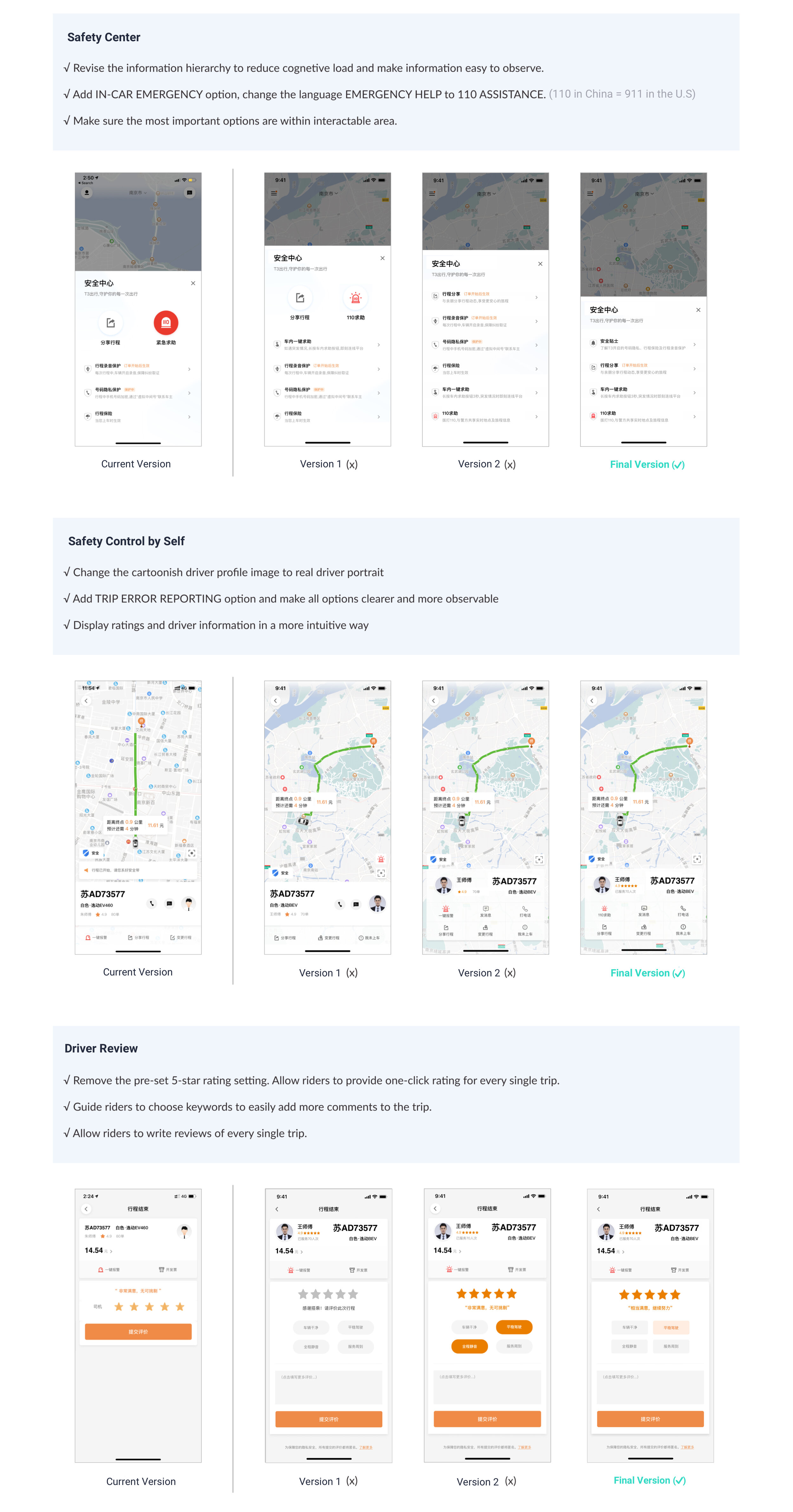
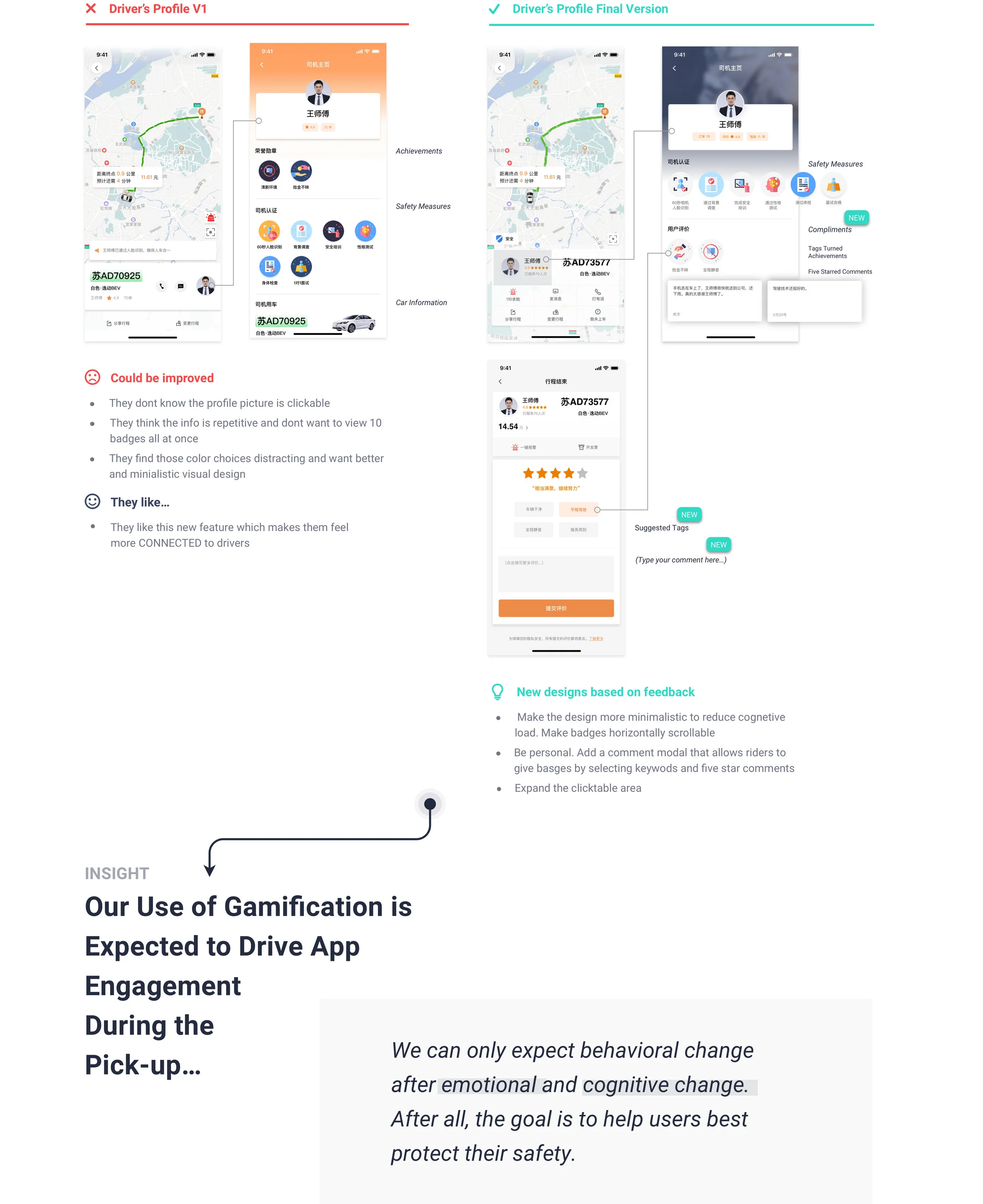
DEsign Iteration
I first sketched on paper and then made hi-fi prototypes to test the design. Later, I went to team meetings and design critics to get feedback from cross functional teams. Here are the design changes we made in the process.
Usability Testing
How Do We Evaluate Iterations?
The design that the product team wanted was not the design that the users wanted. As a designer I face this struggle all the time where designers across different departments and project managers have different assumptions about what works for users the best. Without testing with users, what we essentially designed may not satisfy real users needs to enhance confidence
FINAL DELIVERABLES
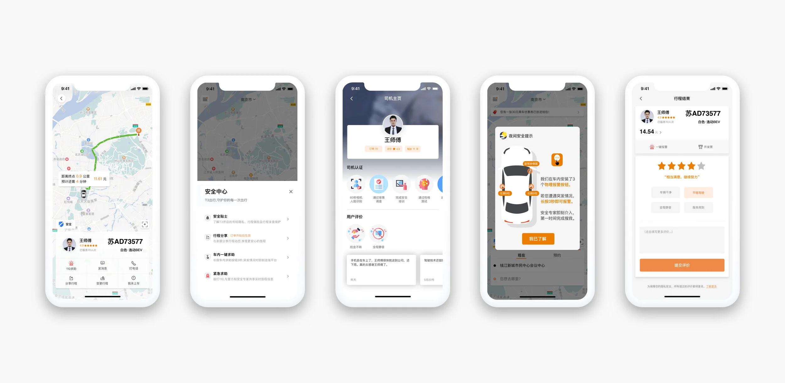
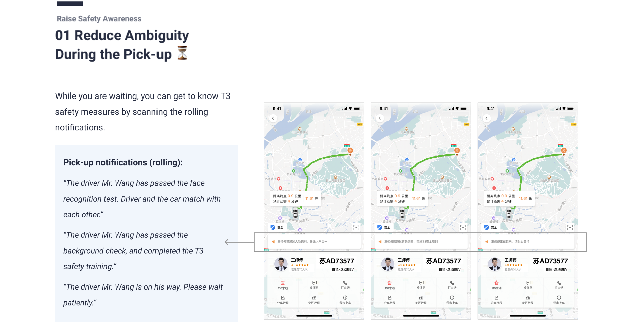
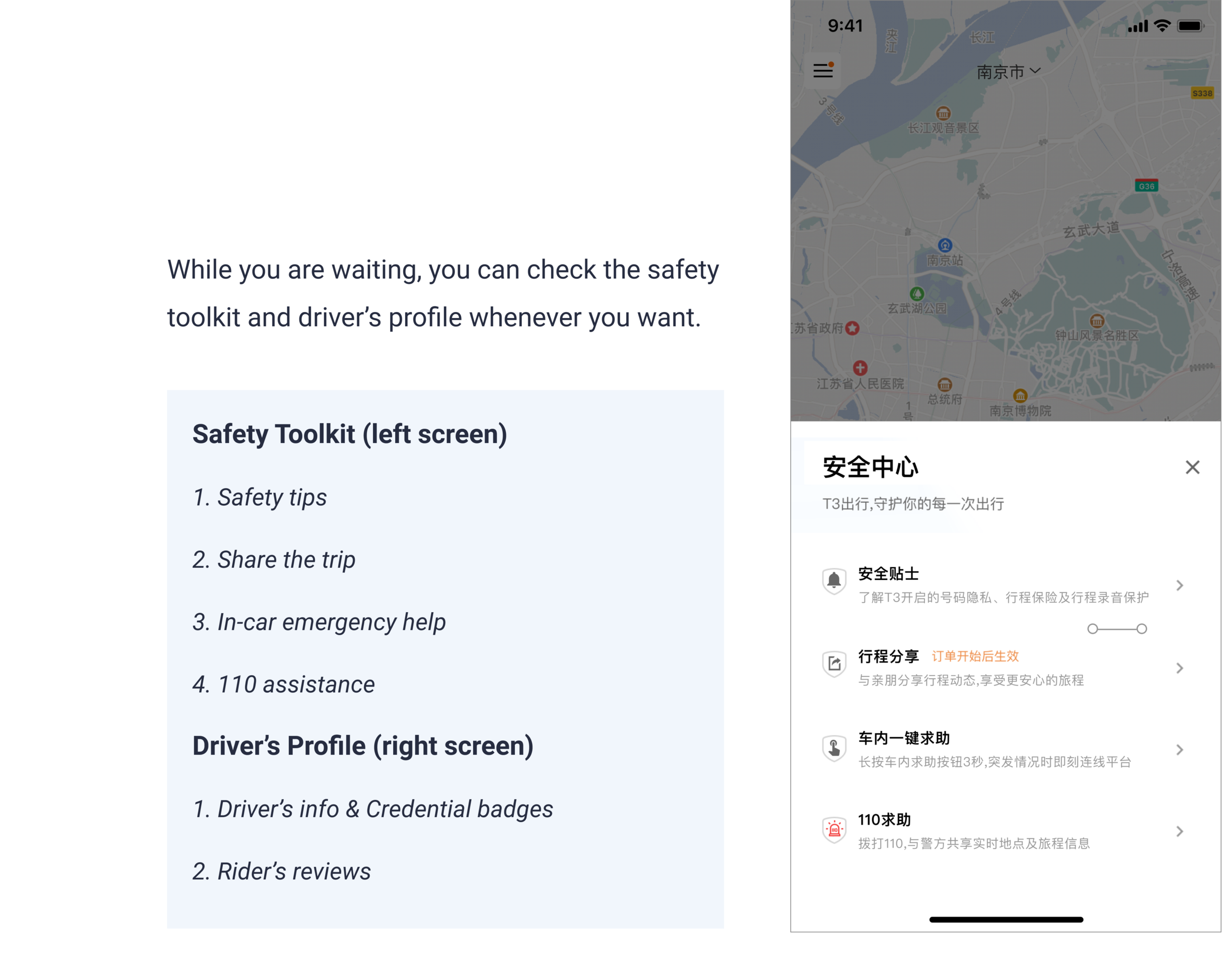
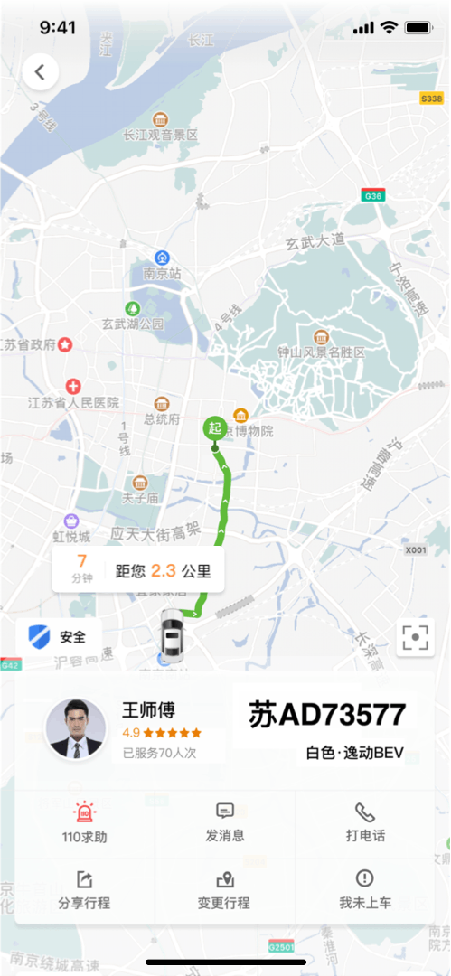
Scenario Walkthrough
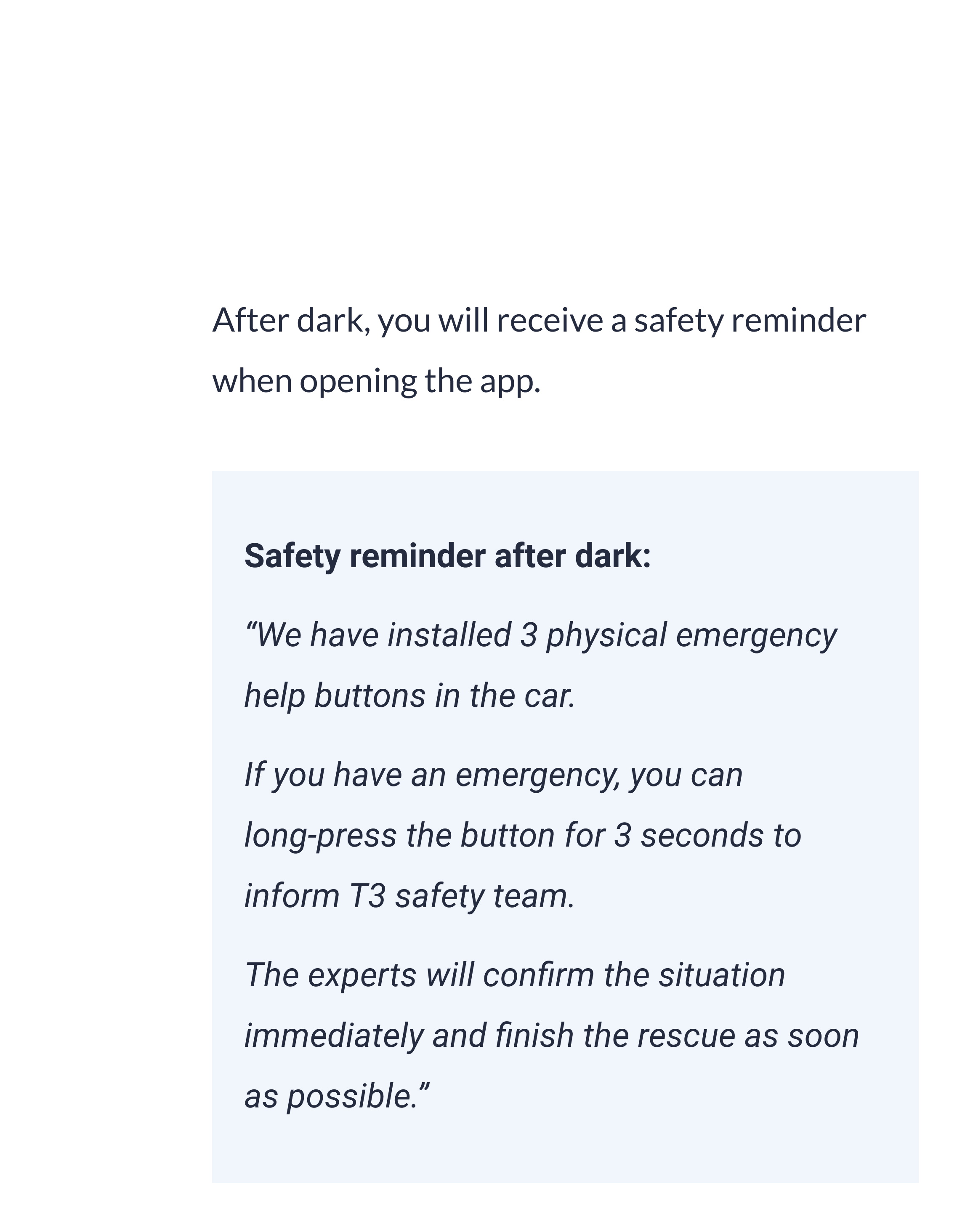
We highlighted safety measures riders can take and the technology T3 uses that keeps riders and drivers connected. We made sensible decisions for users to erring on the side of protection— informing riders in ways that are understandable and actionable.
STYLE GUIDE
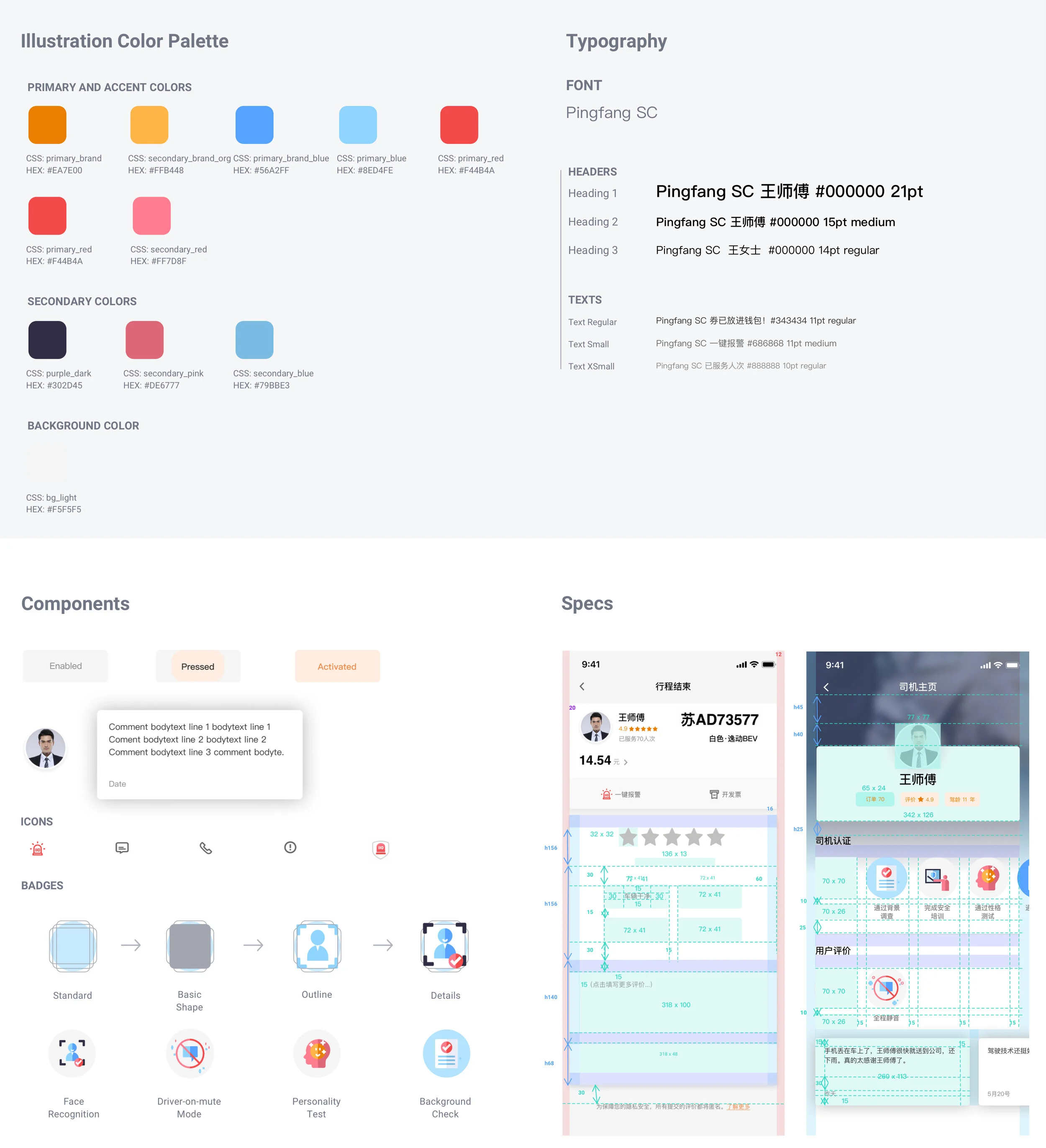
Communicating with Front-end Engineers
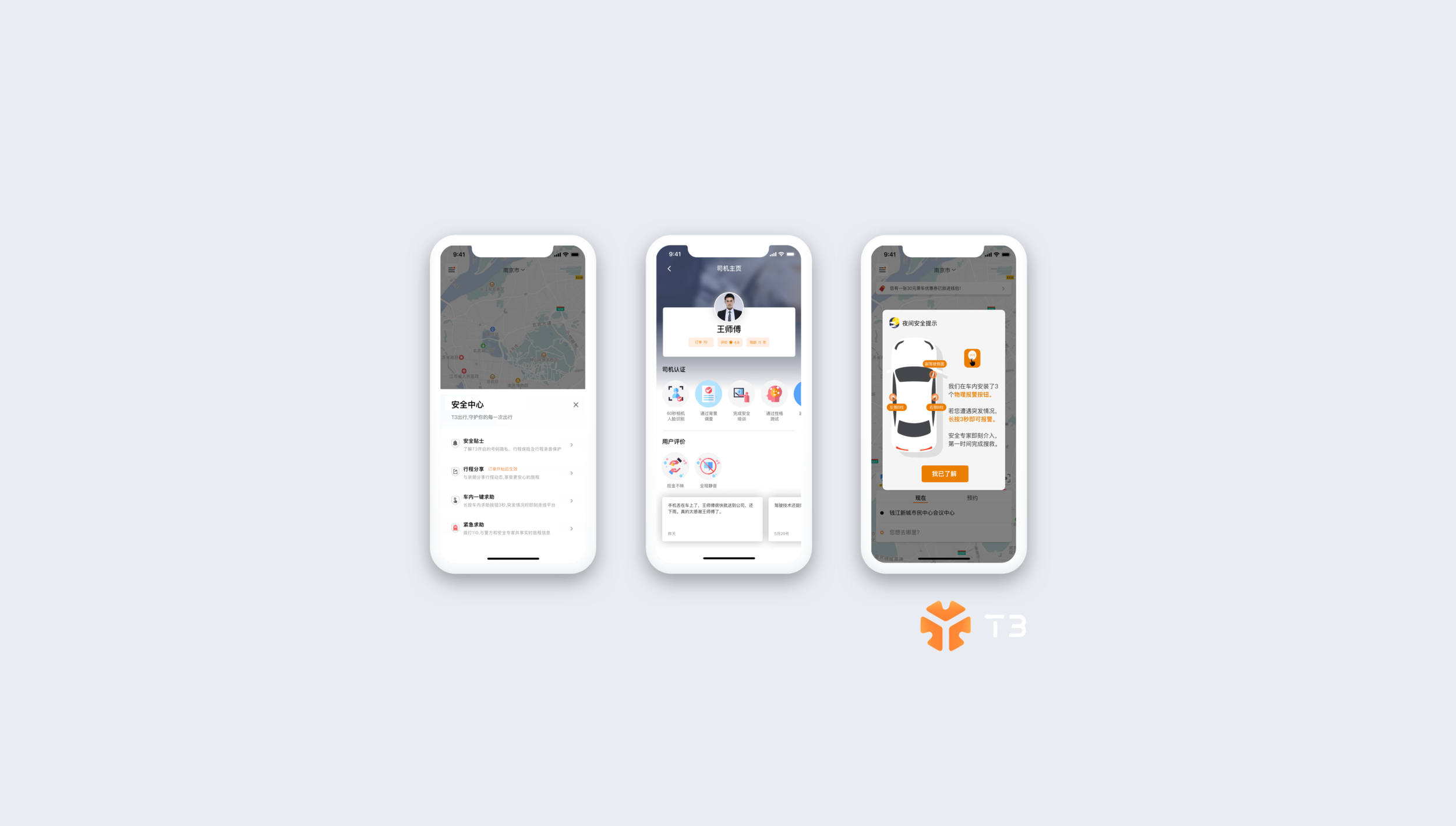
I created documents to make sure the design language stays consistent. It helps to communicate design requirements to the engineering team and support our design quality.
EVALUATION
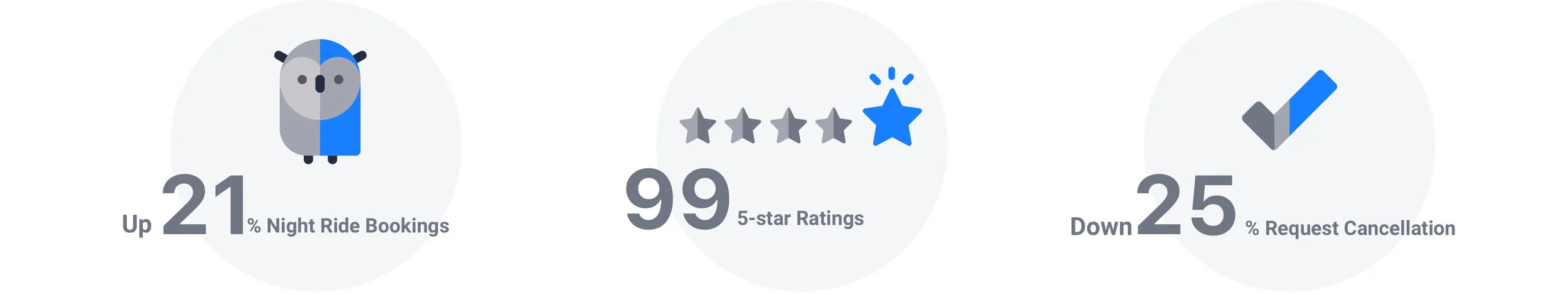
The numbers
Focused on Engagement when Testing
Since we tested the effectiveness and usability in the Beta testing phase. We focused on user’s engagement when we collected data from 120 testers from the T3 community. Here’s 3 main KPIs to show the impact:
The Feedback
A Good Start and it’s Still Day One…
“I like the gamification aspect of the whole user journey. We should explore more on that.”
After I presented the design solution, the CMO, Dong and provided positive feedback and decided to explore the under-age-riding-alone experience for Q2, 2020.
KEY TAKEAWAYS
Always Validate Design by Testing
Designers and PMs often know “too much” to make good assumptions about the product or the users. Had I not test my early iterations with real users, I would not have changed my focus from elevating the design lanaguage and visuals to enforcing the built-in features in the cars.
It helped the team to be efficient and pre-validated our assumptions before we go through A/B testing.
It’s Best to do One Thing Really, Really well
We focus on riding alone experience exclusively on solving confidence problems. We know what we did well, and how we could do it better. Through continued iteration on difficult problems, we’ve been able to solve complex issues and provide continuous improvements to a service that already makes ride-hailing a safe and seamless experience for millions of people.
Our dedication to improve riding confidence apply what we’ve learned to T3’s unique features, like SOS buttons installed in car and real-time face checking. Our hope is to bring the power of search to previously unexplored areas, to help people access safety protection and to use even more of T3 rides in their lives.
Thank you for making this far. T3 2.0 is currently working in progress. Meanwhile, you can try T3 1.0 on App Store.