Apple Podcasts Redesign: Perfecting Desired Content Management
OVERVIEW
THE BACKGROUND
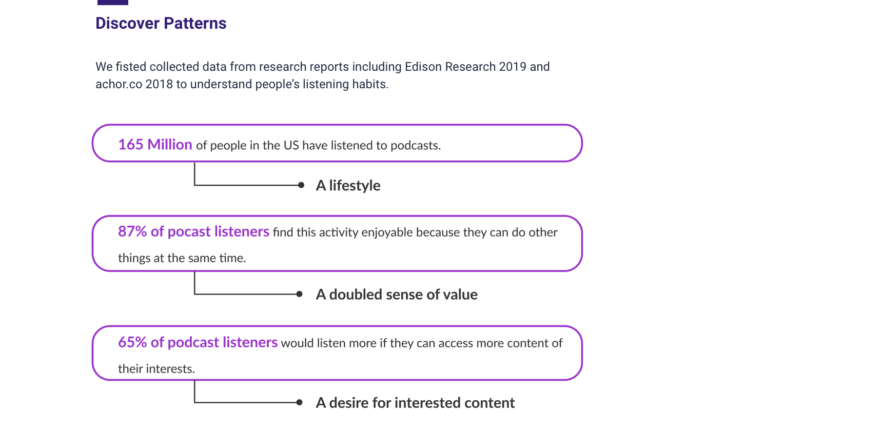
We Listen to Podcasts More Frequently than Ever Before but…
Clipings from online forums
For exploratory research, we collected user voices from online forums to get a general overview of user’s experiences with Apple Podcasts. While Podcasts holds its position as the largest open podcast platform, users are not satisfied with the current experiences, instead they started to seek for replacement regardlessly. What’s wrong?
Problem Statement

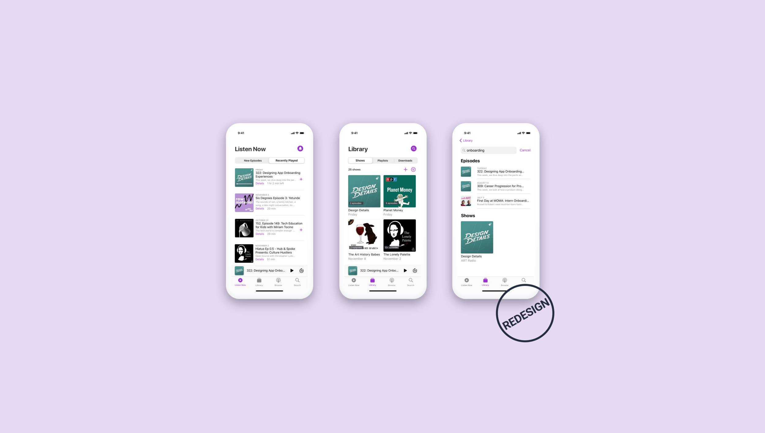
The Solutions
Shortening User’s Learning Curve to Provide an Intuitive Way to Relocate & Personalize

DEFINE

IDEATE
THE APPROACH
Know What's Now, Know What’s Next


DESIGN
THE USER FLOW
Creating Criteria to Evaluate Complexity of Locating Desired Content
We also created the user flow chart to help us get a clearer idea of the user journey and more specifically how many clicks the user would take to locate episodes, shows, playlist, downloads and other desired content.
Click to enlarge the chart
PROTOTYPE
Scenario Walkthrough
Introducing Small but Effective Symbols to Give Users a Logical Path to Follow
We did competitive research on popular content based apps including Apple Music. We were aware of the user habbits Apple nourished and adopted Music’s AI and introduced new icons and symbols that lives with the Apple SF Symbol family.
User Tests
I ran a user test with 6 participants with a clickable prototype to quickly:
Validate that users could find the desired episode entry and would like to add it to a customized playlist.
Is the new information architecture clear to users.
Study Results
Users could easily navigate through because of the more precise information architecture, especially using the segemented controls. Still, I found whether we provide clarity of the content of each episode is the key to affecting the first time users trying it or not.
And also, after many discussions with users and reseachers, to meet the needs of different physical environments and scenarios to be while users are listening to Podcasts, a auto-rolling title could avoid confusion inbetween episodes in the future, provide better scalability for our product.
Style Guide
Creating Cohesive UI Components
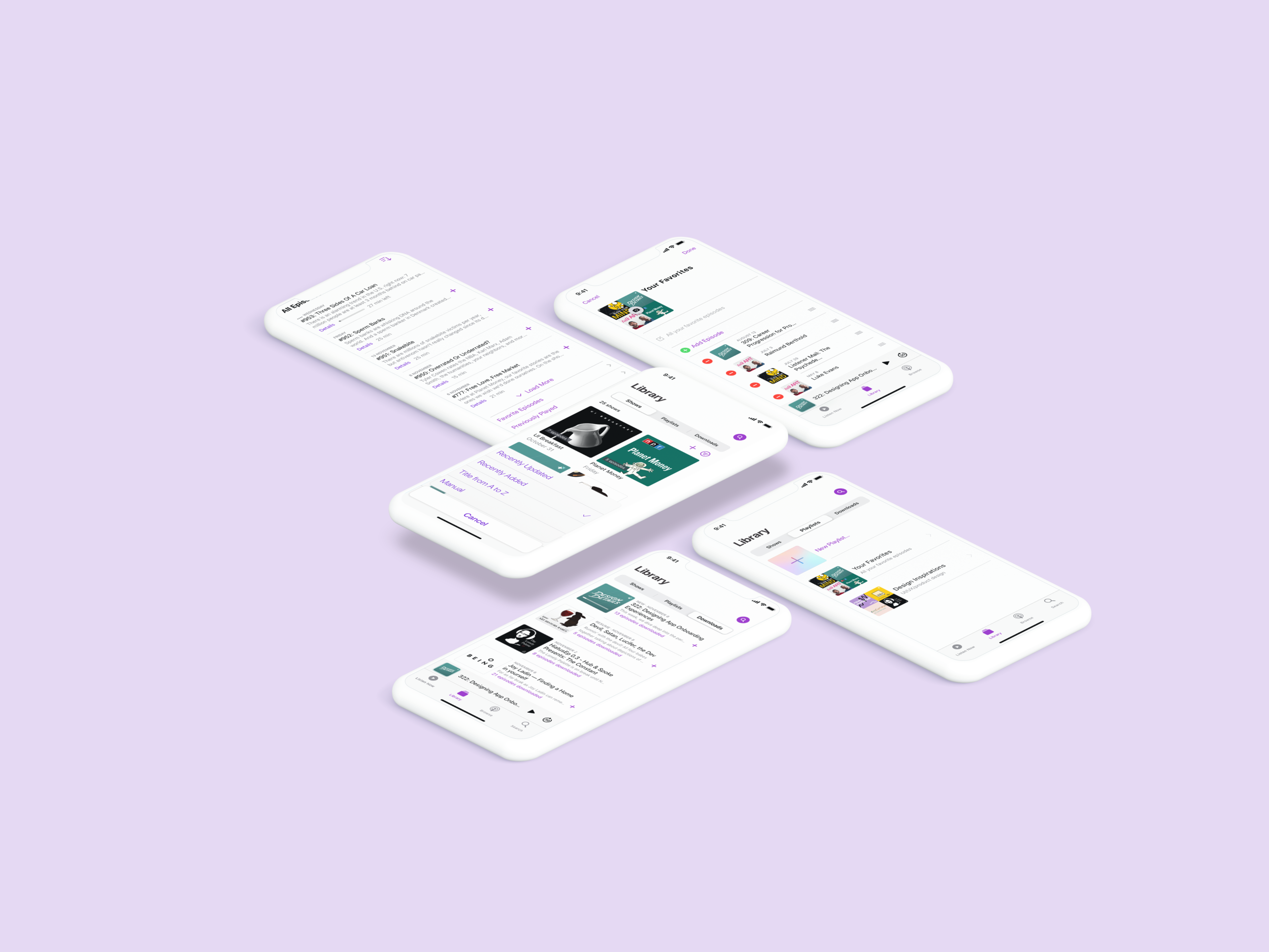
Final Screens
Delivering Hi-fi Clickable Prototypes
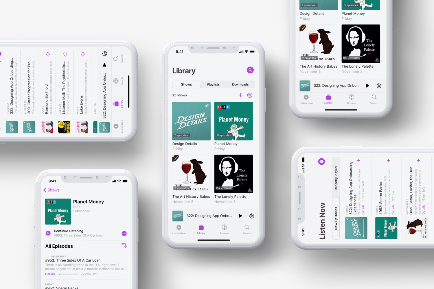
Finally, all four segments, Listen Now, Library, Browser and Search, have been refined following the same design direction with visible icons used to translate the intimate quality of sorting, searching and editing options. Bringing it all together are small surprises visible throughout the user-flow, giving it a sense of confidence and serendipity.
EVALUATE
Usability Testing
This Time, the feedback was overwhelmingly positive…
“It’s like an Apple Music version of the podcast app. Since I am familiar with Apple Music, it’s much easier to take actions ... I’m surprised that creating my own playlist existed before. ”
“I can just jump into my pre-set queue and doing my laundriest without actually having to sit and scroll, trying to connect the content to the show title ”
We received positive feedback from Podcasts active users by testing the clickable prototype. 80% of the testers (8/10) said they are more likely to use Apple Podcasts than other apps.
REFLECT
KEy takeaways
Building Empathy Creates Powerful Design
Quantitative data is a good tool for understanding what is happening but it won't tell you why. For that, I need to turn to qualitative data (talking to people). This time, I asked people with in-context small surveys and started to understand user’s behaviors and needs. People listen to podcasts on smart phones as they are often pre-occupied and takes minimum time on the screen. We should help people focus on other things by designing the UI as a subtle frame for the information they’re interested in. Our approach of minimizing the number and prominence of controls helped us to achieve our design goals and increased user satisfaction.