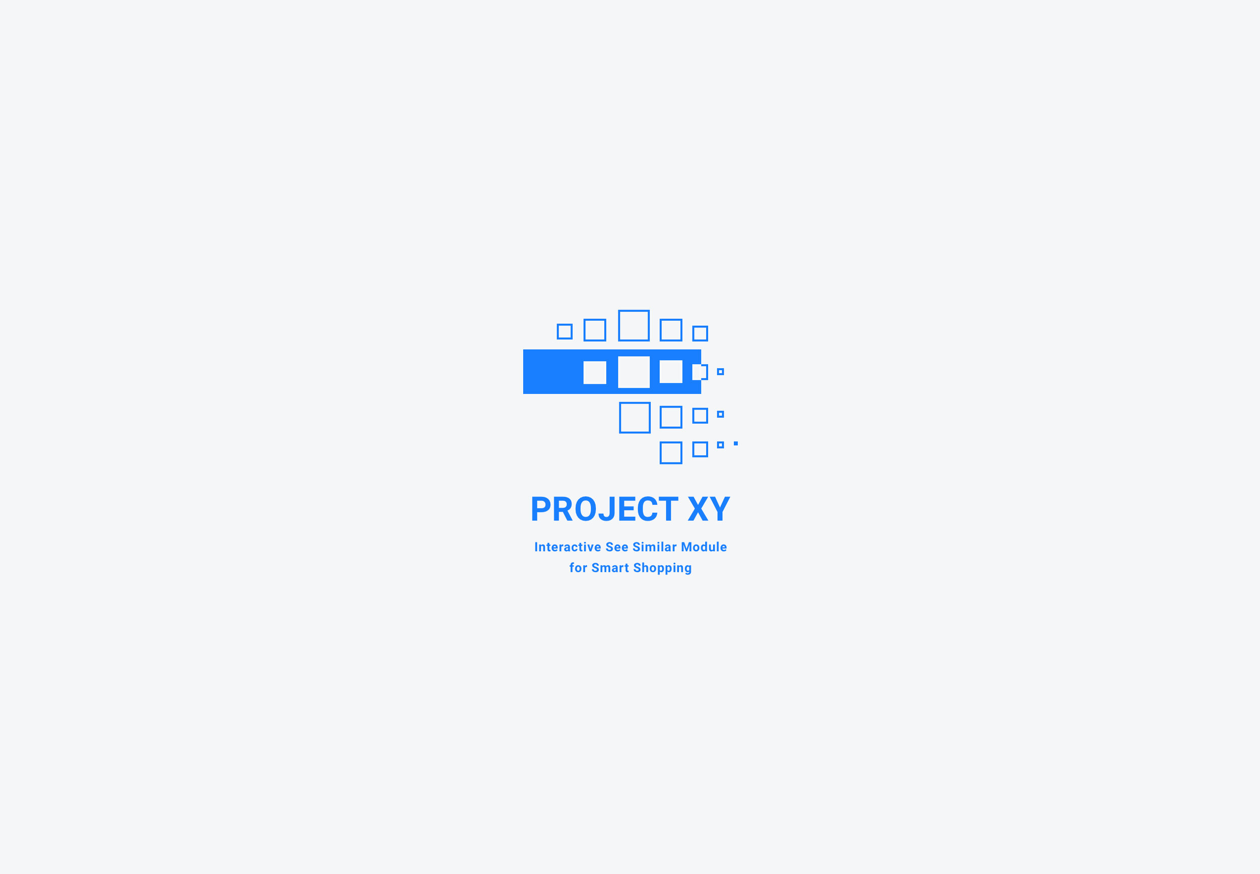
Walmart Project XY: Empowering 100 Million+ Website Users to Pivot Ideal Furniture
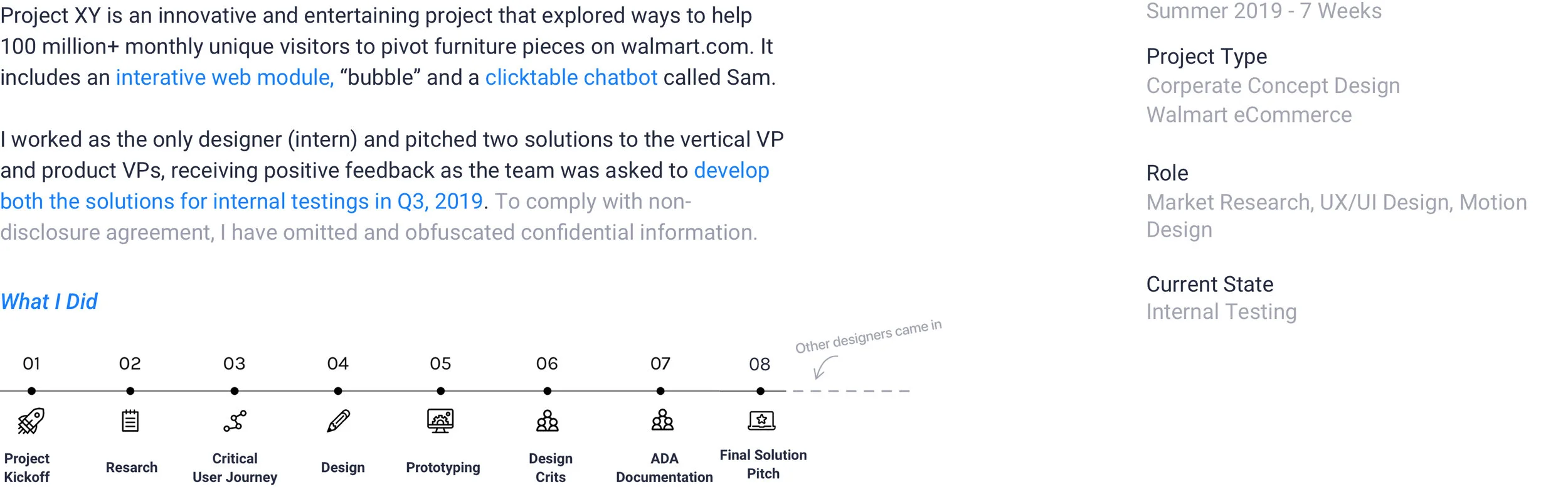
OVERVIEW
About Project XY
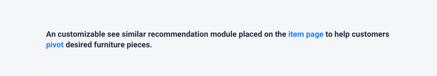
Recommending Items by Features on walmart.com
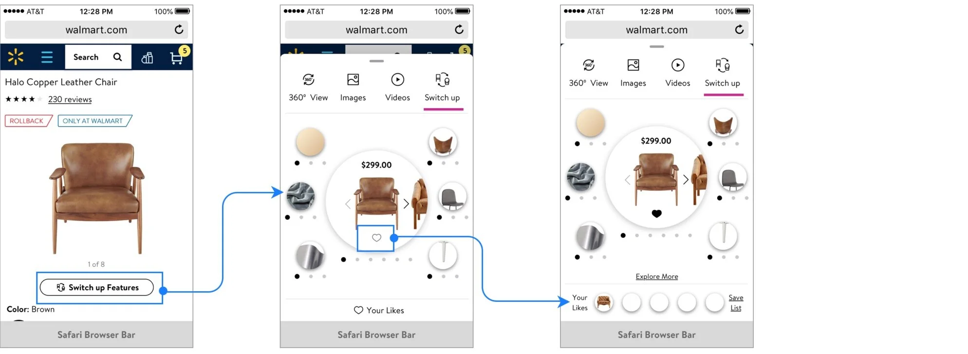
Project XY Module on Item Page with the Jump Link
How it Works?
With a sleek Flow, we empower users with an attribute based search engine to discover similar, but with different customizable characteristics.
It was inspired by SEO search rankings to capture attribute/features of available products while allowing users to alter the default attributes (features) of the current product.
It’s handy, highly-personalized, and traffic-driving.
THE 1ST DIAMOND
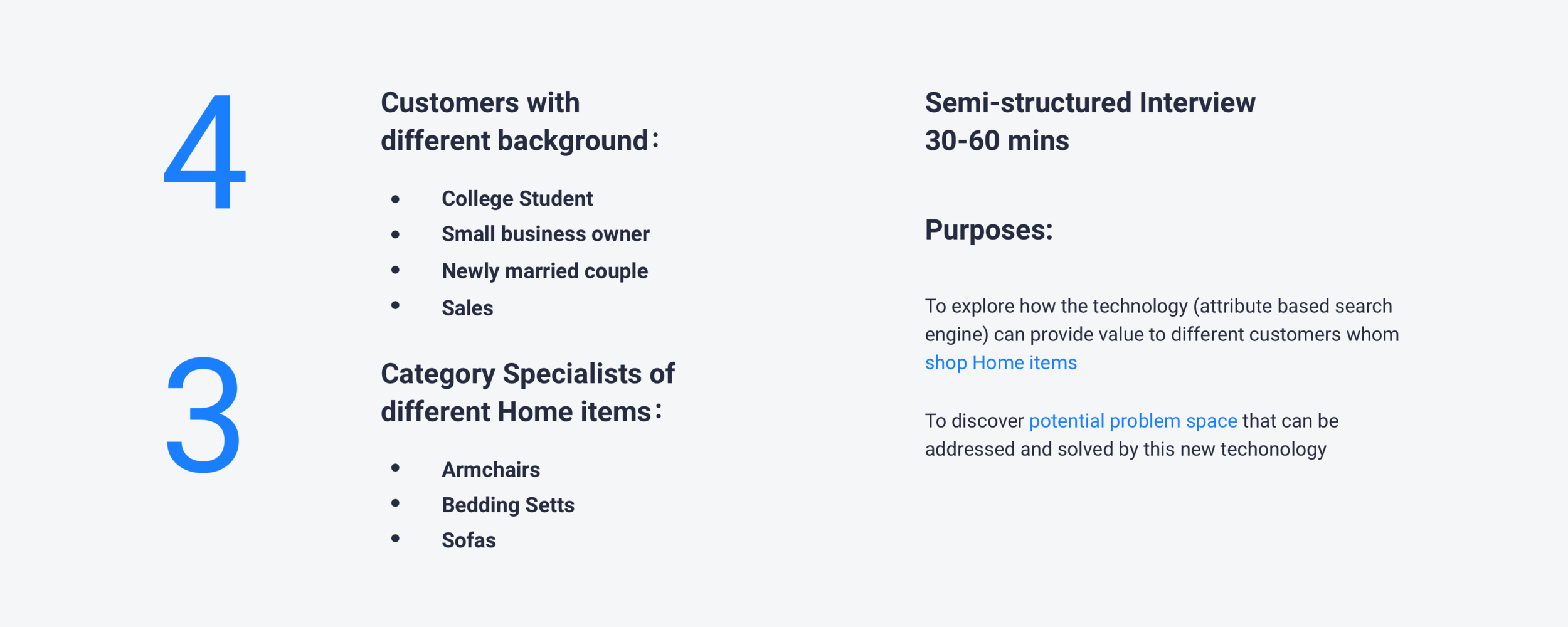
Exploratory Expert Interviews
Kicking-off the Project by Talking to the Stakeholders
In order to find a promising area that Project XY is able to create value for customers, I started off by doing exploratory interviews with 4 customers and 3 category specialists with different background. The purpose of the interviews was to explore how this technology can be applied to satisfy customers’ needs and wants, to discover potential problem space and then identify an area I should focus on.
EXPLORE THE AREA to APPLY
The Scope
Refining Project Scope through Several Runs of Iterations
After presenting my exploratory research deck to the Head of Home Design, we refined the project scope together as following. I’ve also gained a deeper understanding of the business mission behind Project XY. Here’s the refined scope:
THE 2ND DIAMOND
Research METHODS
Desktop research and quantitive research on the website traffic were conducted to explore the problem space and discover existing user problems. I also participated in several runs of Speak-out-loud to align while I designed.
Current State
Only 10% Visitors Actually Click the Recommendations on walmart.com/home—What’s Wrong?
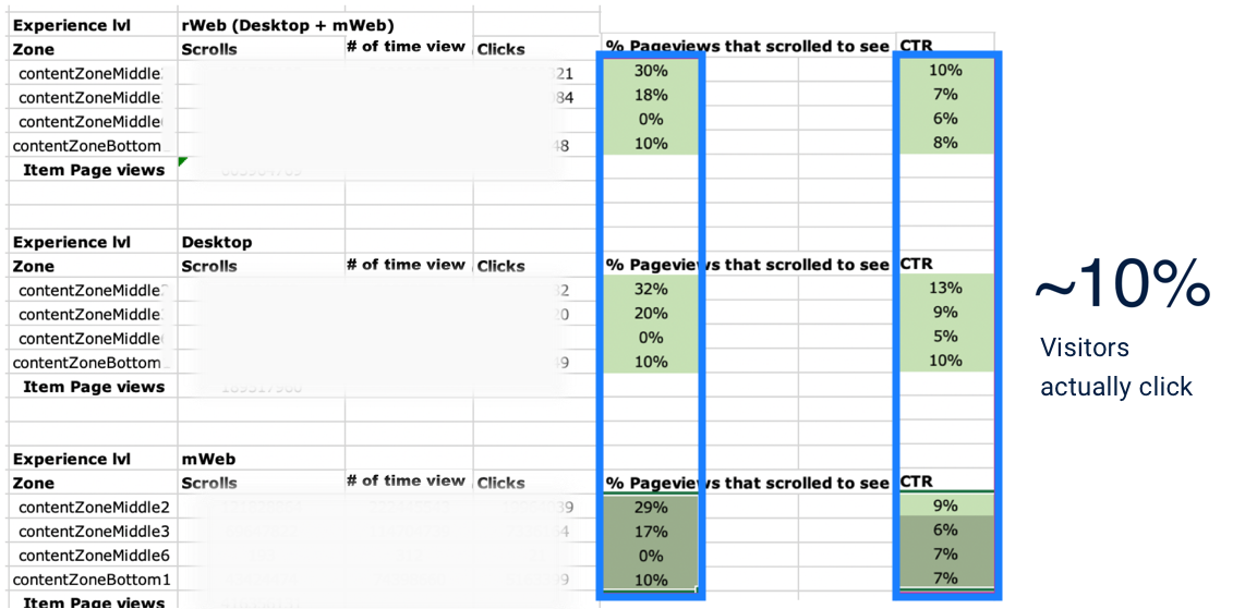
CTRs of Recommendation Modules on Home Item Page
Walmart.com is Walmart eCommerce’s main shopping website with 100 million+ monthly unique visitors.
We discovered that visitors for home and furniture products, have little interest in the recommendation modules throughout the item page (listed on the left).
Key Insights
Data told us customers tend to start with one item, as the item page have more clicks than the category page itself, but they find it hard to expand the journey. Combined with findings from the 1st Dimond, Here’s what we synthesized:
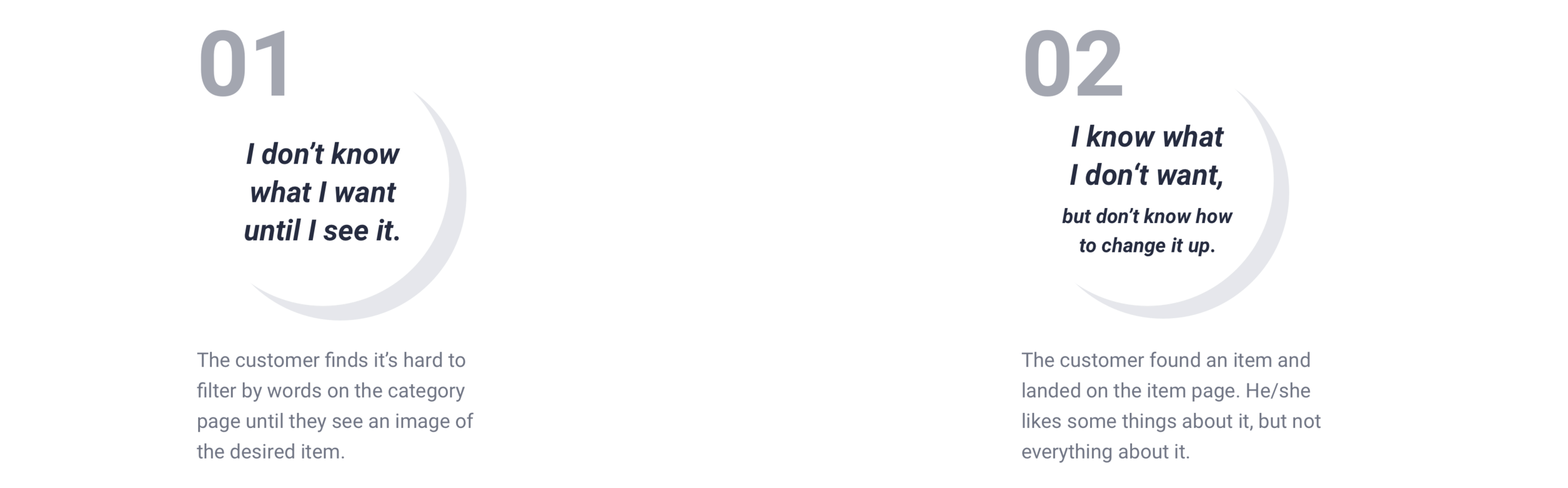
Client’s Challenges
Landing on the Perfect Furniture is a Pure Luck
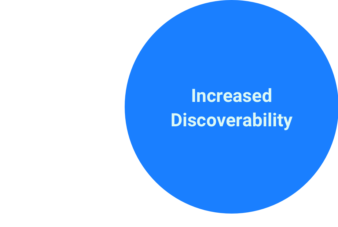
We have low discoverability on the items that are listed below the first three row on the category page.
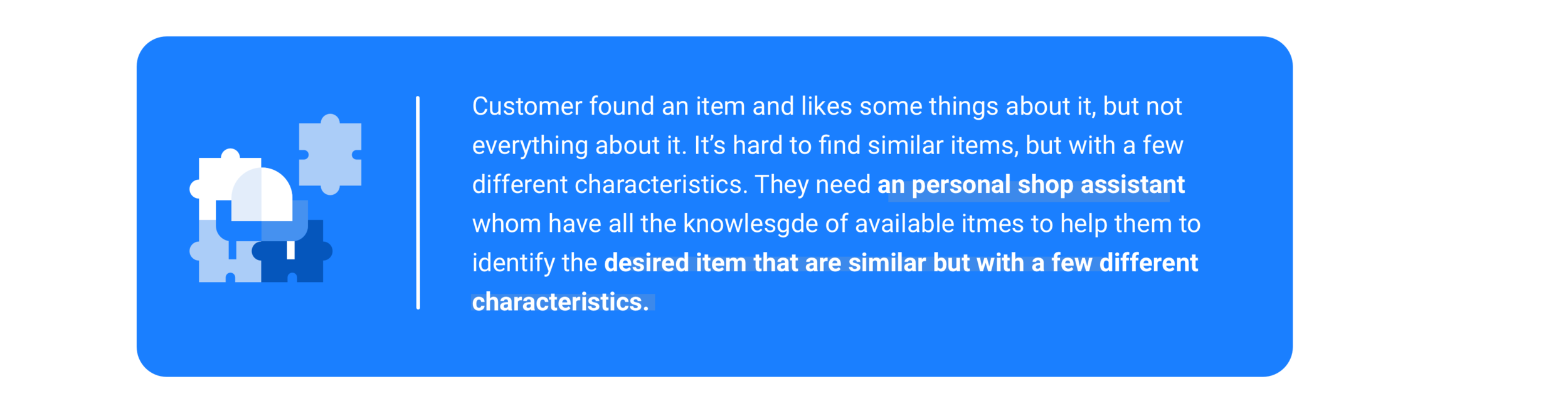
Customers found it hard to land it on the “perfect” item (page) they want for their first try.
In the end, they bounce as the recommendation are not similar items but with different small details they want.
Design Goals
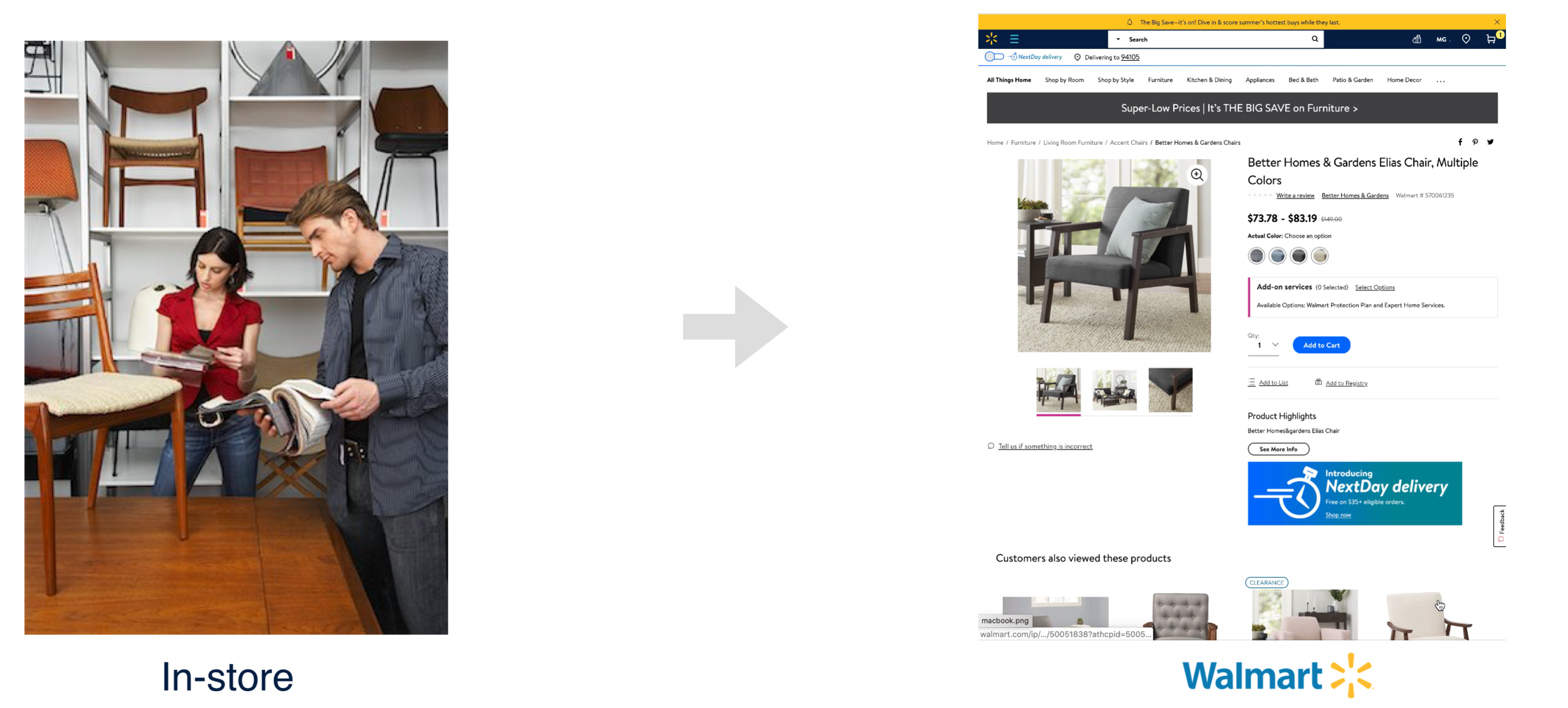
Bridge the Gap between Online and In-store Pivoting to Allow Customers to Reimagine the Highly Visually Suggested Comparing Experience
I synthesized the key values of Project XY and further defined the problems I aim to address through the design.
Metrics for Success
Setting up Metrics to Evaluate Design
The PM and I set up three main metrics to evaluate the outcome. It also helped me stick to the business goals while designing.
THE 3RD DIAMOND
Information Architecture
Main Structure — A Flow for Product-focused User Type
Based on the rainbow sheet and evaluation of the current website, my team and I defined 5 main features: change up features, pivot search results, like and compare, and item information.
Also, we will have a landing page to introduce the feature and attract new users to interact.
Here is the information architecture that I created:
IDEATion
Isn’t just Aiming to Save Users’ Time—it Also a Pivoting Process Mimicking In-store Experience
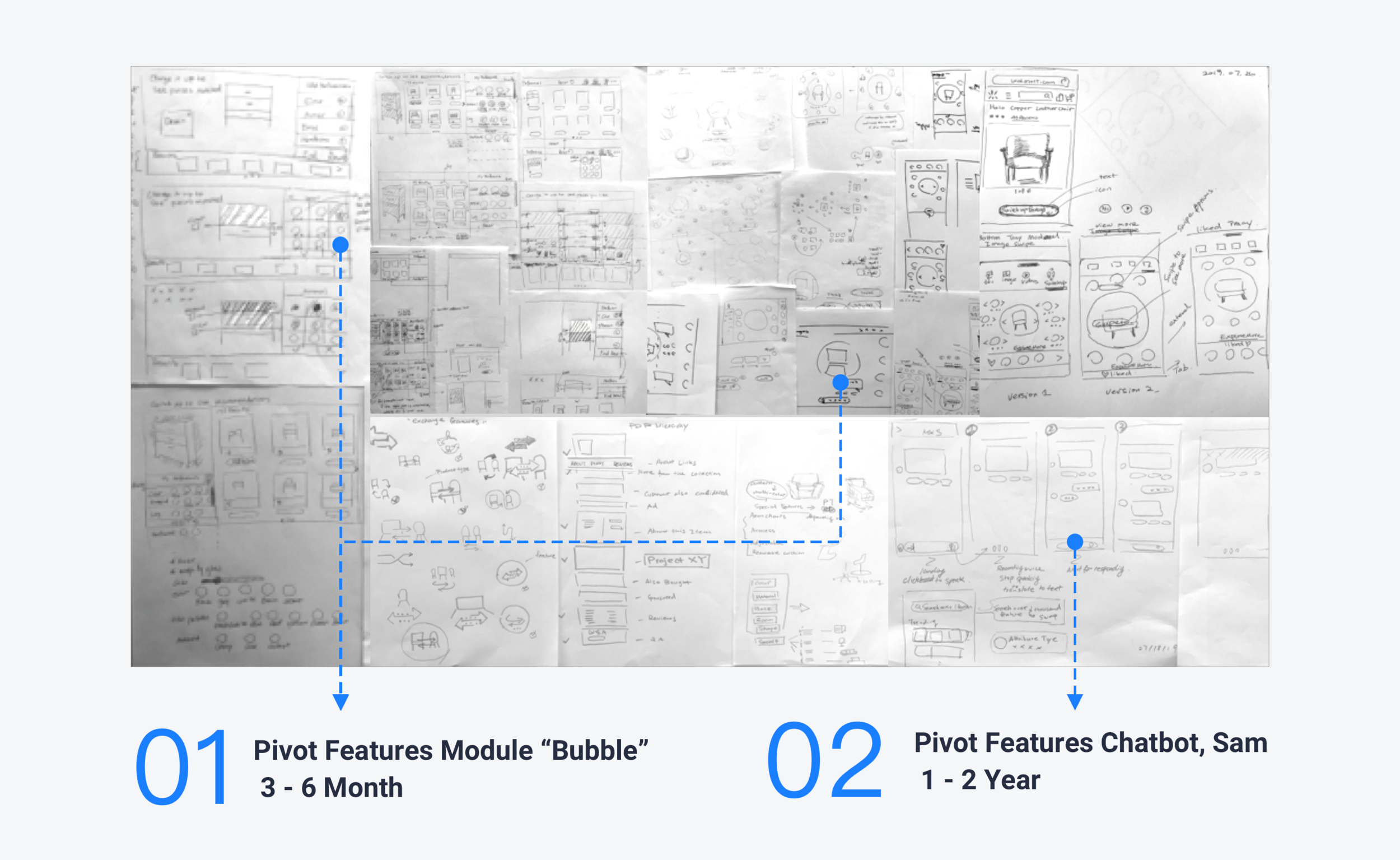
Inspired by the problem discovered through previous study and insights from the user research, I did the first round of brainstorm and then integrated the ideas into 2 main concepts. Considering the technical feasibilities, I focused on the Pivot Feature Module, “Bubble.”
Solution Overview
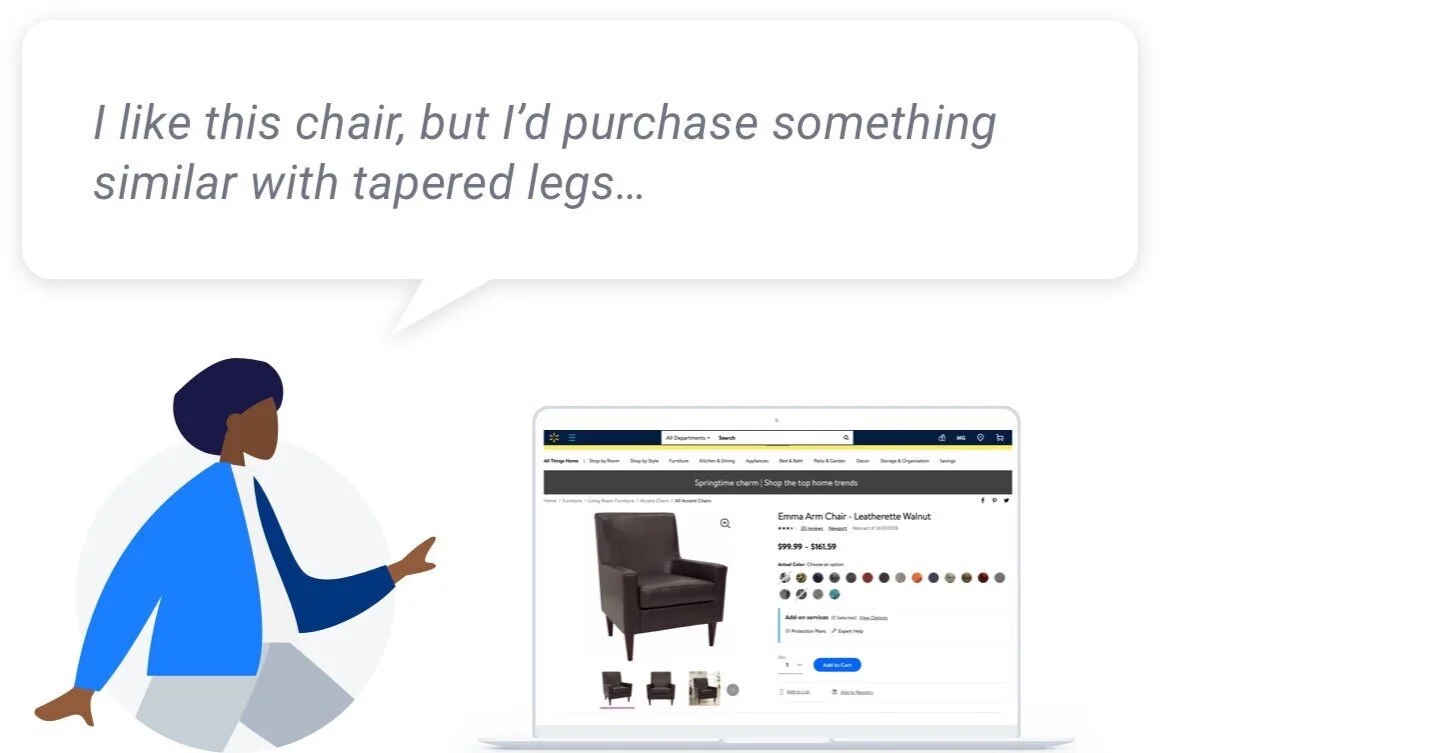
SOLUTION 01: Pivot Features Module
Pivoting the Final Purchase
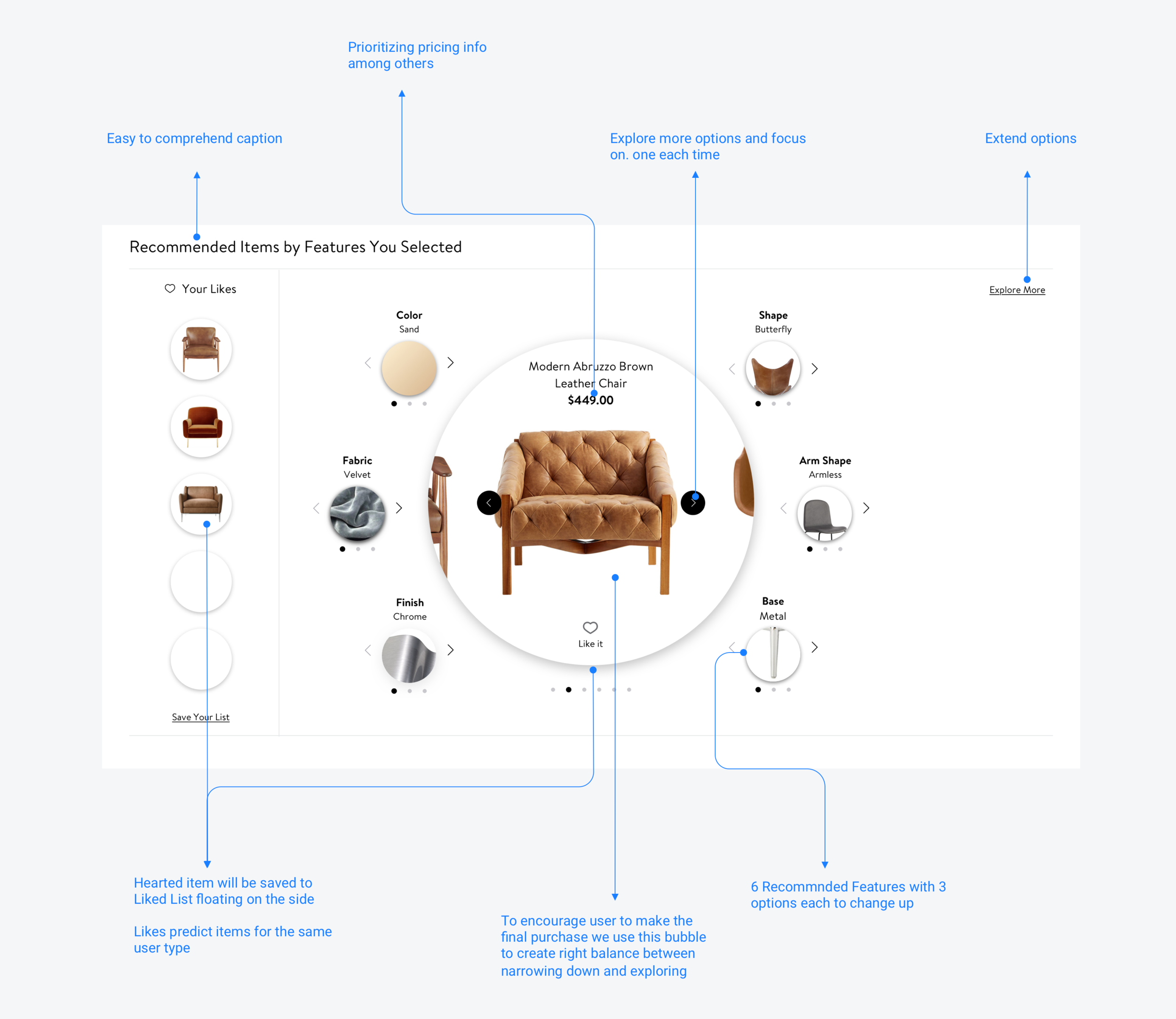
The visually intriguing module allows customers to change up small features from the current item and juxtapose it against liked items to finalized the purchase.

The Placement
How Far Do People Scroll—Chances Are Not So Far

Design for 100 million+ Costumers
Walmart.com is visited by 100 million + unique visitors every month. The eco-system of the we co-designed by different verticals — adding this new module on the very top means pushing other modules down and will affect their discoverability.
Design Decision Making
We have decided to place the module below the item information to create a logical user journey. We acknowledged that only 20% customers will scroll this far. I implemented the jump link on top to make to solve the issue.
Accessibility: ADA Custom Codes
When I designed the service, I also considered accessibility. I coded the focus order in a circular way, making sure the design is intuitive and confirmed all colors passed WCAG 2.0 AA standards.
Screenshot of Customized Focus Order Codes
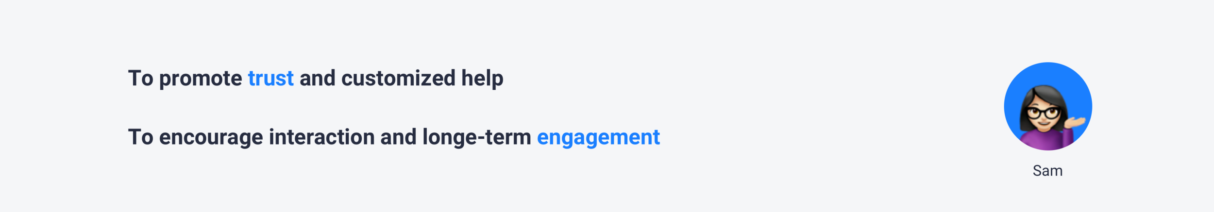
SOLUTION 02: Pivot Features Chatbot, Sam
To further reflect Walmart Home’s “made-to-measure” ethos, we created a chatbot tool to tackle full in-person experience. From sizing, to color choices and all attributes stored back-ended, this online “interior designer” serves as an extension to the store service experience.
Solution Overview
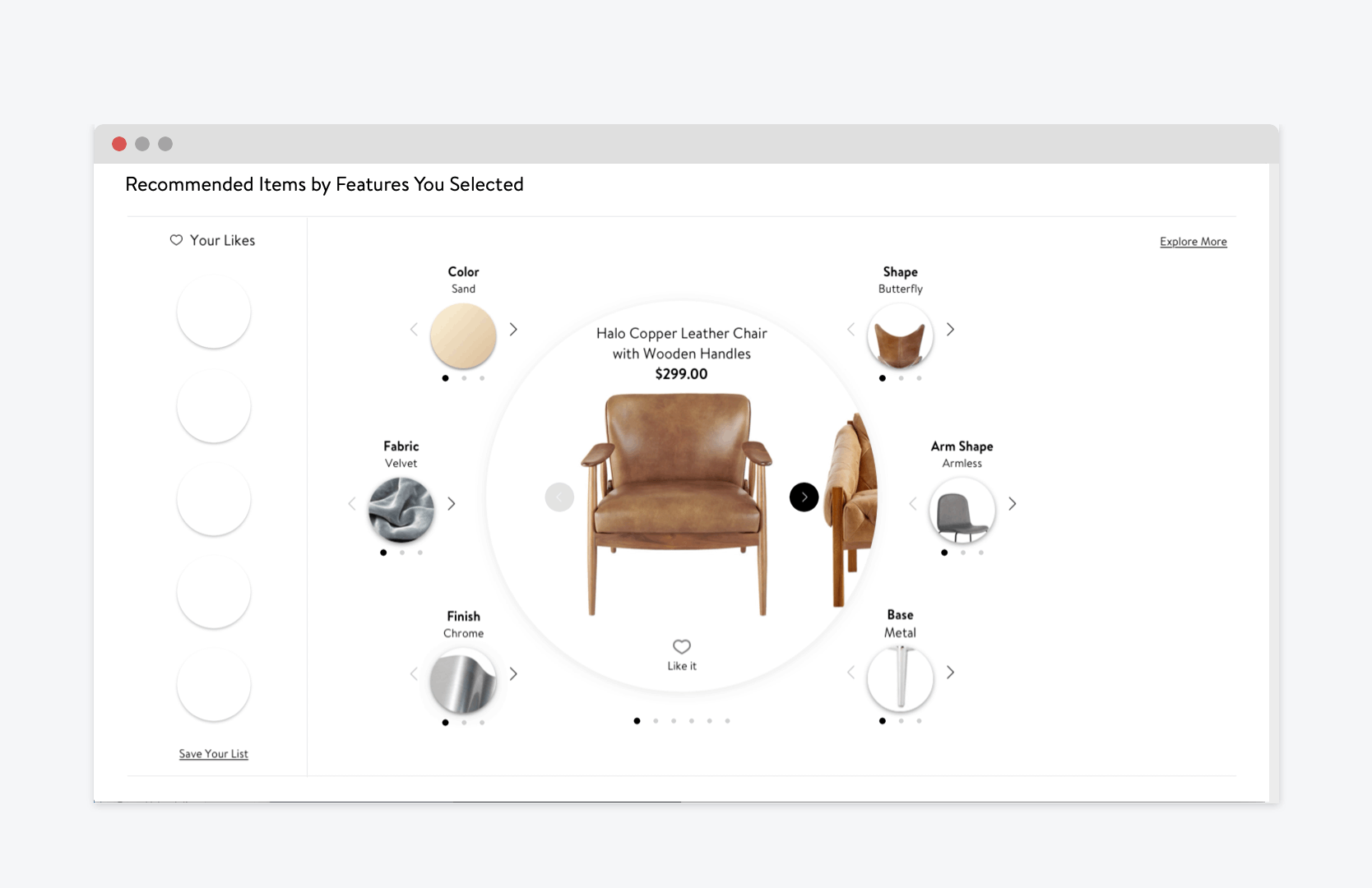
Visualizing Concept by Creating a Clickable Hi-fi Prototype
The prototype below shows how the user pivots a similar chair but with black color and metal, adjustable base:

We made sensible decisions for users to reduce cognitive load, giving only three clicktable visual examples of features at a time with the unlimited options powered by voice and type search. It also enforces the affordance of this conversation design.

DESIGN PROCESS
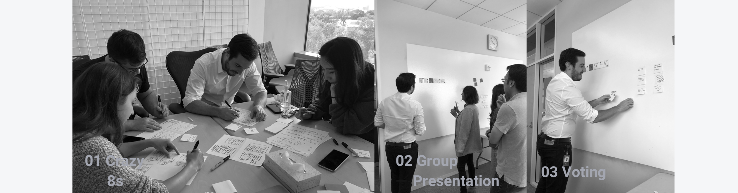
DESIGN SPRINT
Design Never Stops: Continued to Explore Ideas by Hosting Design Sprint for the Voice Version
I continued to perfect the interactive prototype in the last two week. In the meantime, I hosted Design Sprint to gather ideas for the Voice version. I reached out to designers and researcher from different verticals and invited them to join the 2-hour Sprint together with project managers and engineers.
Bot Personality
Isn’t just Aiming to Save Users’ Time—it Also a Pivoting Process Mimicking In-store Experience
various Use Cases
Worked with Content Writers to Create Natural Conversations
Click to enlarge the image
EVALUATE
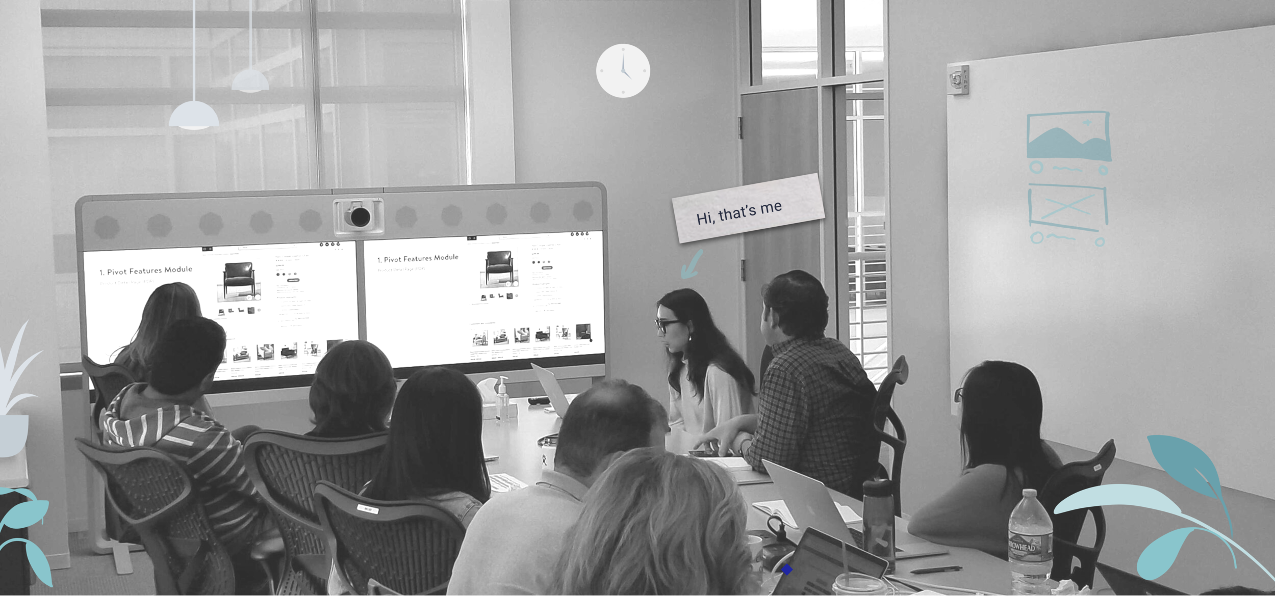
The Feedback
The Vertical Decided to Push it Forward in the Next Quarter
“We should add project XY to Q3. We can A/B test it on some $200 furniture starting with 2 features.”
After I pitched two versions during the weekly Home Vertical meeting, our VP Anthony provided positive feedback and decided to build version 1 during Q3, 2020. Anthony even asked the engineering team to start to build some back-end prototypes for the Voice version. Later, our design manager and my hiring manager connected with designers at Jetblack to get more insights on how chatbot and voice products are designed.
Design Critique
A Young Designer’s Self-reflection
I have run several design critiques with my team and with designers from other teams at different stages of my project. Here are some thoughts about design critiques.
When your design is on the table, it’s no longer your baby - difficult as it could be, try to detach the emotion from it and look at it with a fresh eye.
People would ask very different questions as you present low-fidelity or high fidelity designs. When a low-fi prototype is being presented, people tend to more focus on the high-level concept and interactions. People start to ask more details about the micro-interactions, technical feasibilities, and user interfaces as the fidelity goes higher. So prepare the right prototype according to the goal of the design critique and be clear what kind of feedback is needed.
Animate the user flow if necessary. I found that animation, even made with Keynote, could be clearer than a series of slides. This internship project further honed my motion design skills.
Future Work
Usability Test
Our user testing mainly focused on validating user values with designers. We plan to test more detailed interactions once we finished with prototype with higher fidelity.
Mobile-web Design
Because of the scope and time limitation of this project, we only completed the design of desktop-web. We need to explore ways to maintain a cohesive and similar flow on the mobile-web. Here’s some iterations I came up with and delivered to the team on the last day:
d-Web Exploration A
KEY TAKEAWAYS
Iterate Fast, Fail Fast
Do not blindly chase perfection. I realized that I am one of those designers whom are passionate about making things neat and pixel-perfect. Good designs are born through the cycle iterations. Each day, I made sure my deck is perfect and found it hard to ditch the “endless scroll” version since I spent so much time working on it. I noticed that as long as your work is presentable and serving the purpose, you do not have to make an extra effort to alter the details for one of the iterations. I’ve learnt to iterate fast, digest feedback and move on to the next iteration without hesitation. Instead of getting too attached to the iteration that you don’t have room to grow, sometimes it is important to take a step back and take a look at the big picture. It helps you embrace the failures and bring in better outcomes.
Remember to Collaborate with Cross-functional Team
It was amazing to collaborate with experienced UX Researcher, UX Designers from other verticals, Content Writers, ADA Specialists and Engineers. I’ve learnt to communicate effectively and efficiently with cross-functional team. I’ve learnt how to communicate with respect to everybody’s time both in-person and through the phone meetings. I understand that. it is crucial to help others to align, prioritize my goals for every meetings.